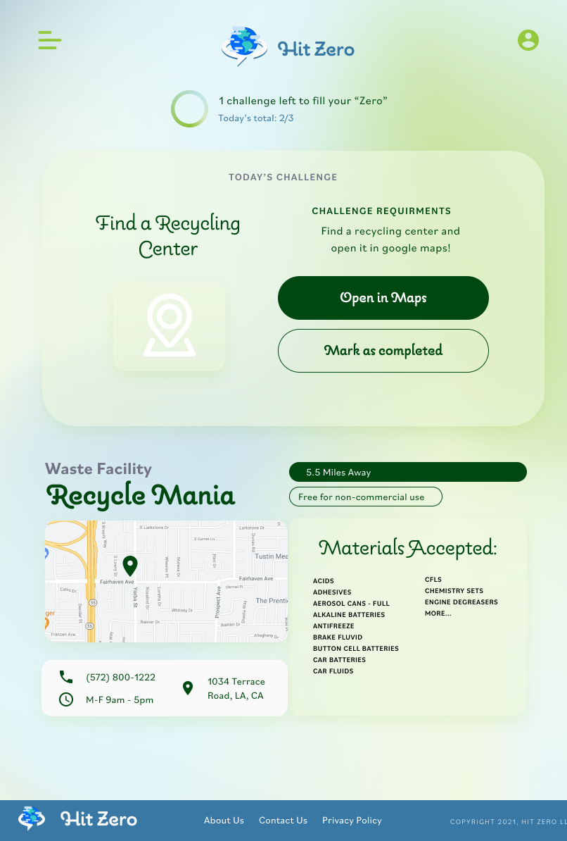
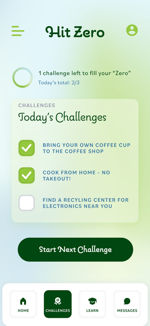
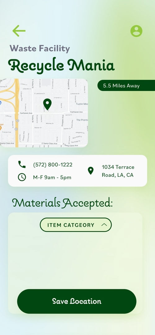

Accessibility Considerations
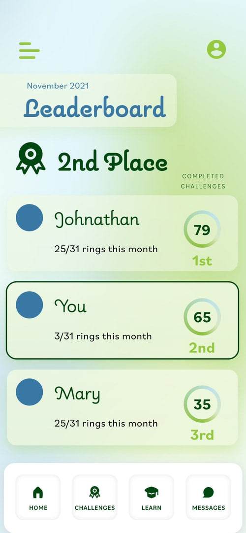
Contrast Ratios pass "A" WCAG rating
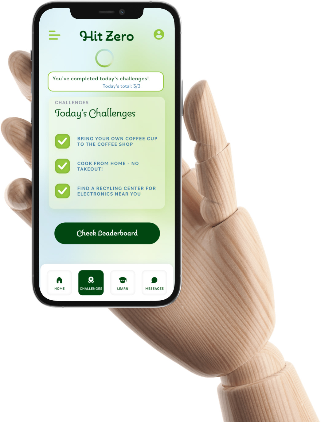
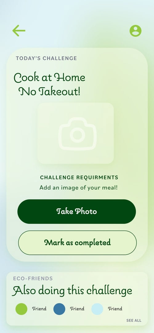
Challenges that ask "take a photo" have option to "mark as completed" if mobility impairments prevent users from taking photos of their food or in other situations
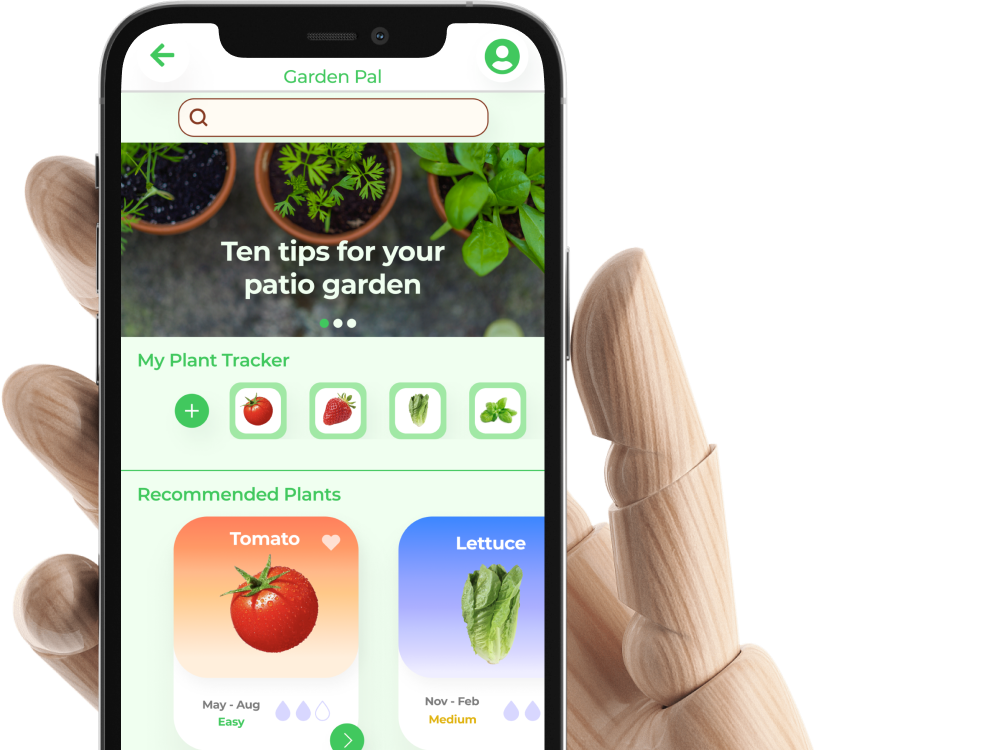
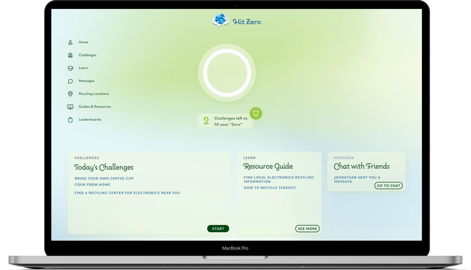
Essential app functions do not require scrolling to complete and have a minium 48x48px tap target
Impact
Based on EPA calculators users can expect a carbon footprint reduction of approximately 600 lbs. per year just by making small changes daily.
What I learned
Motivation is an interesting user problem. Finding ways to encourage users means looking at what's already been done in spaces like fitness apps and applying it in a different sector.
Design System
Process
Competitive Audit
Existing products like Earth911.com and BeRecycled.org provide amazing databases and information like Zip Code based search, but lack a sense of urgency and context to the user's daily life.
Both sites lack a reason to return to them and are missing a social or gamified aspect.
Both sites lack a reason to return to them and are missing a social or gamified aspect.
Shift in Design / Iteration
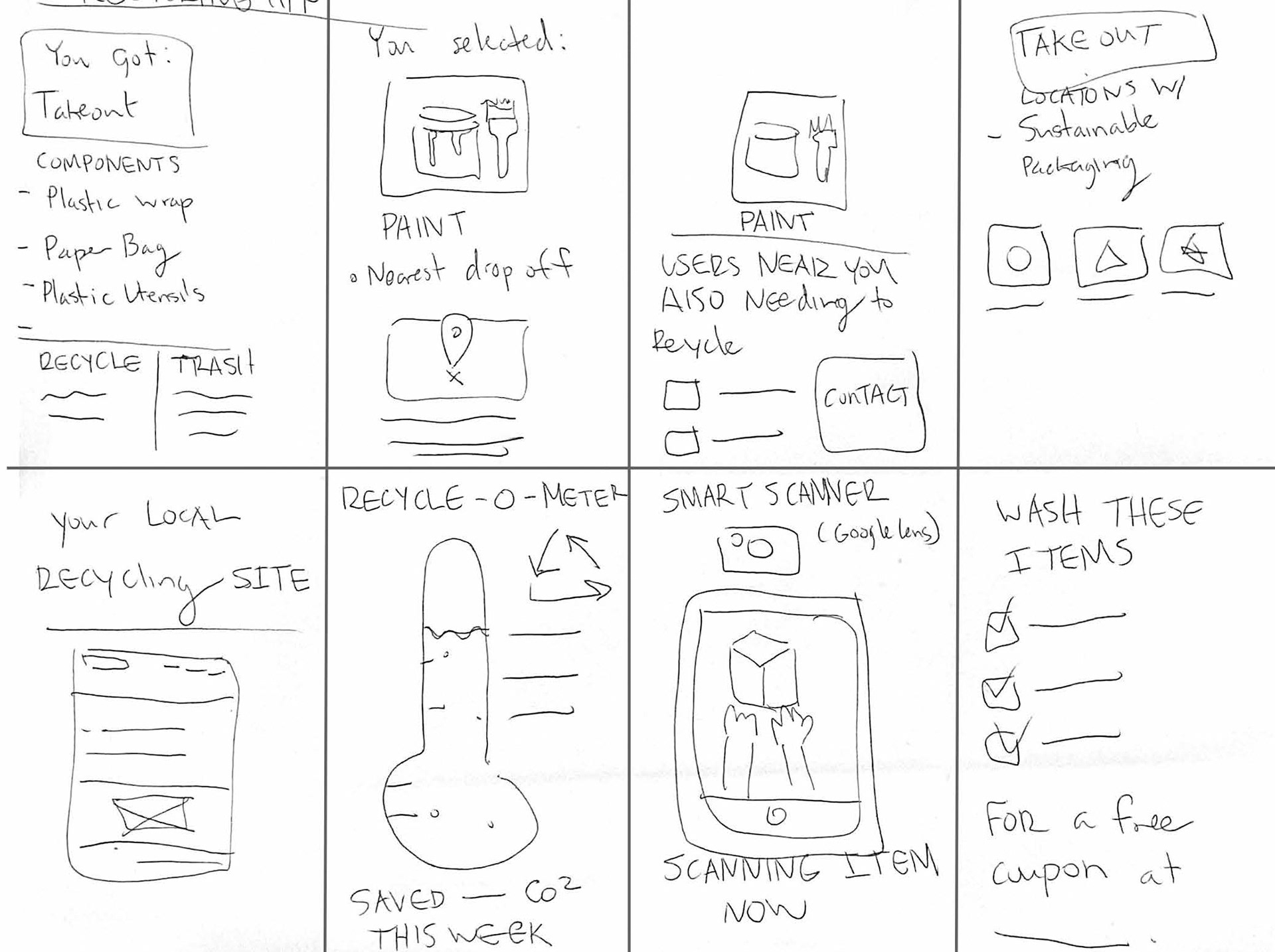
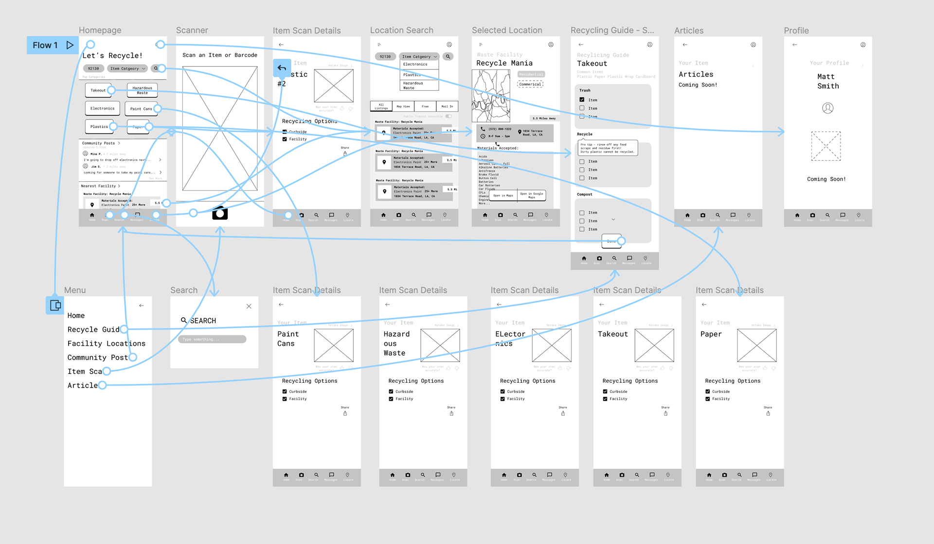
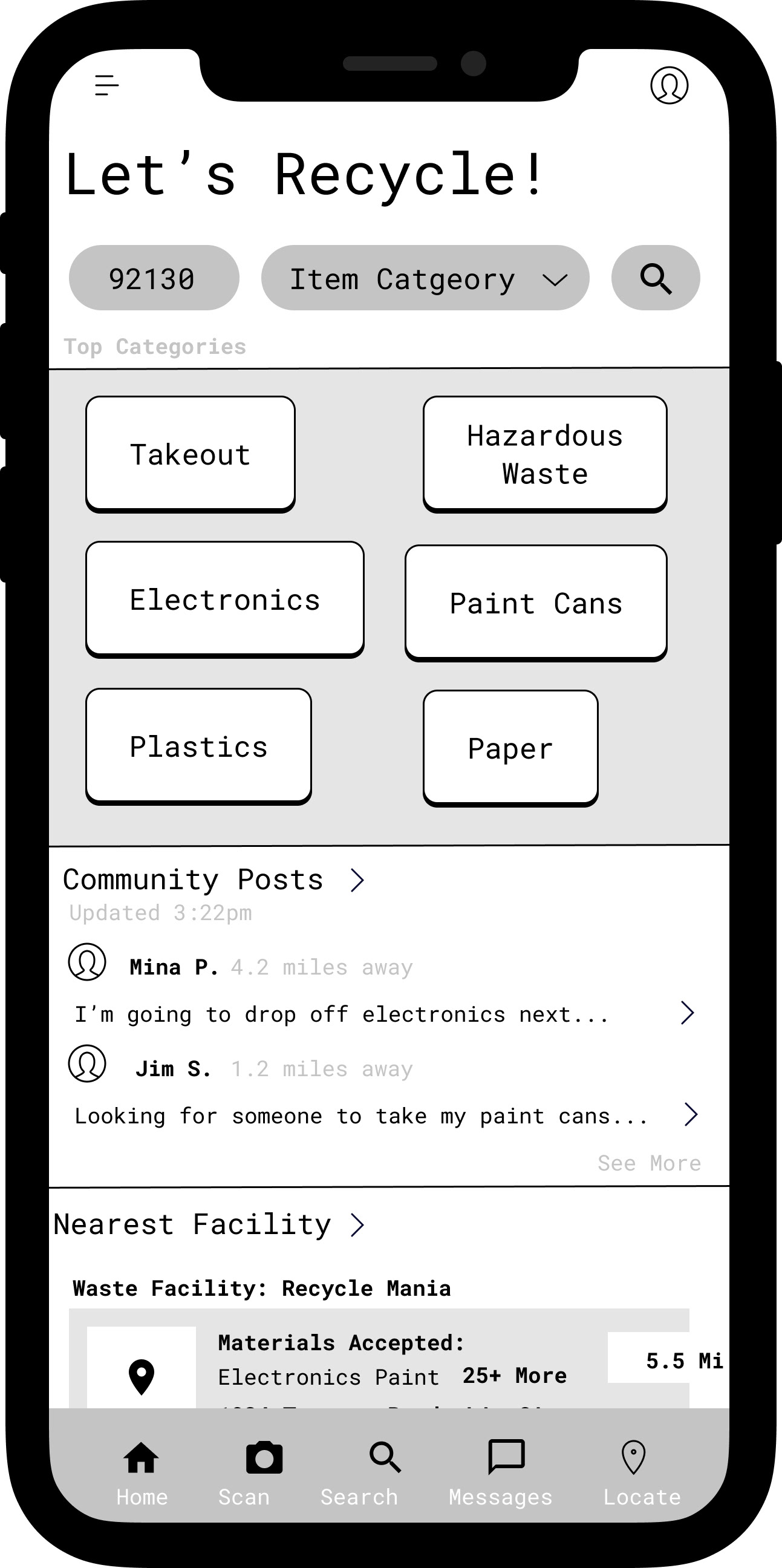
After testing the lo-fi prototype I realized my initial concept for the app was not solving the problem of motivating sustainable actions.
It doesn't matter if you provide recycling info if the user can't be bothered to open the app.
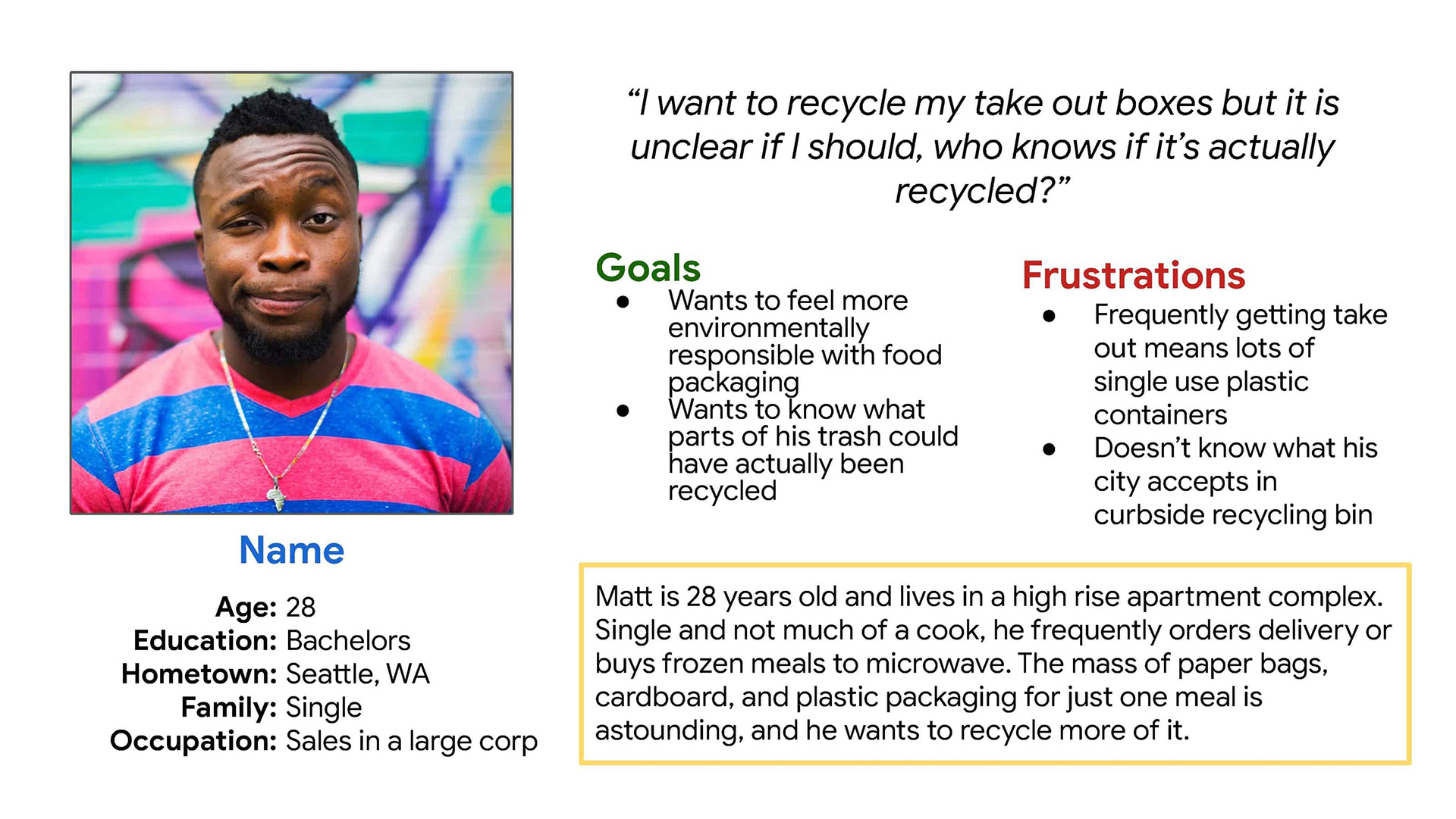
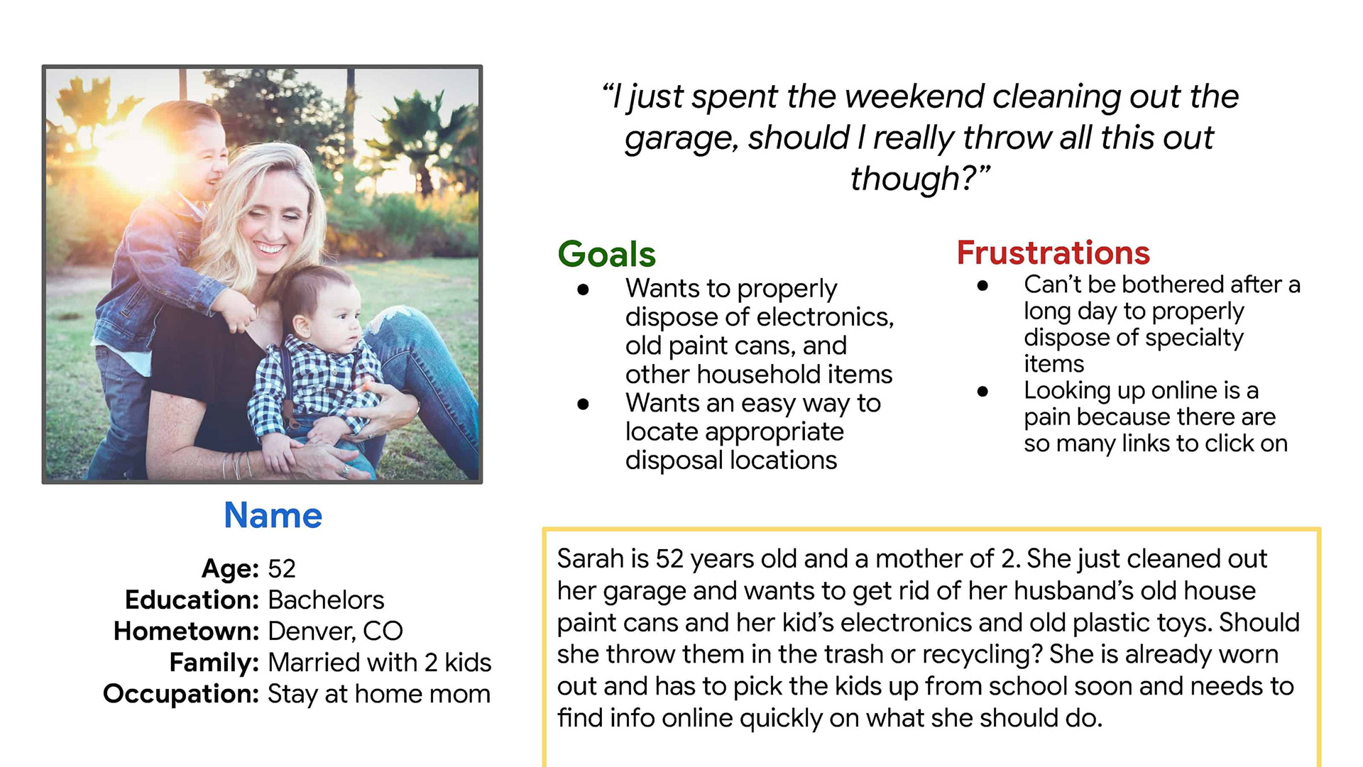
That also meant my personas were off and not truly representing my users' goals and interests.
So I shifted my app's focus from a quick reference guide and community resource to something more timely and social to encourage those habits.
